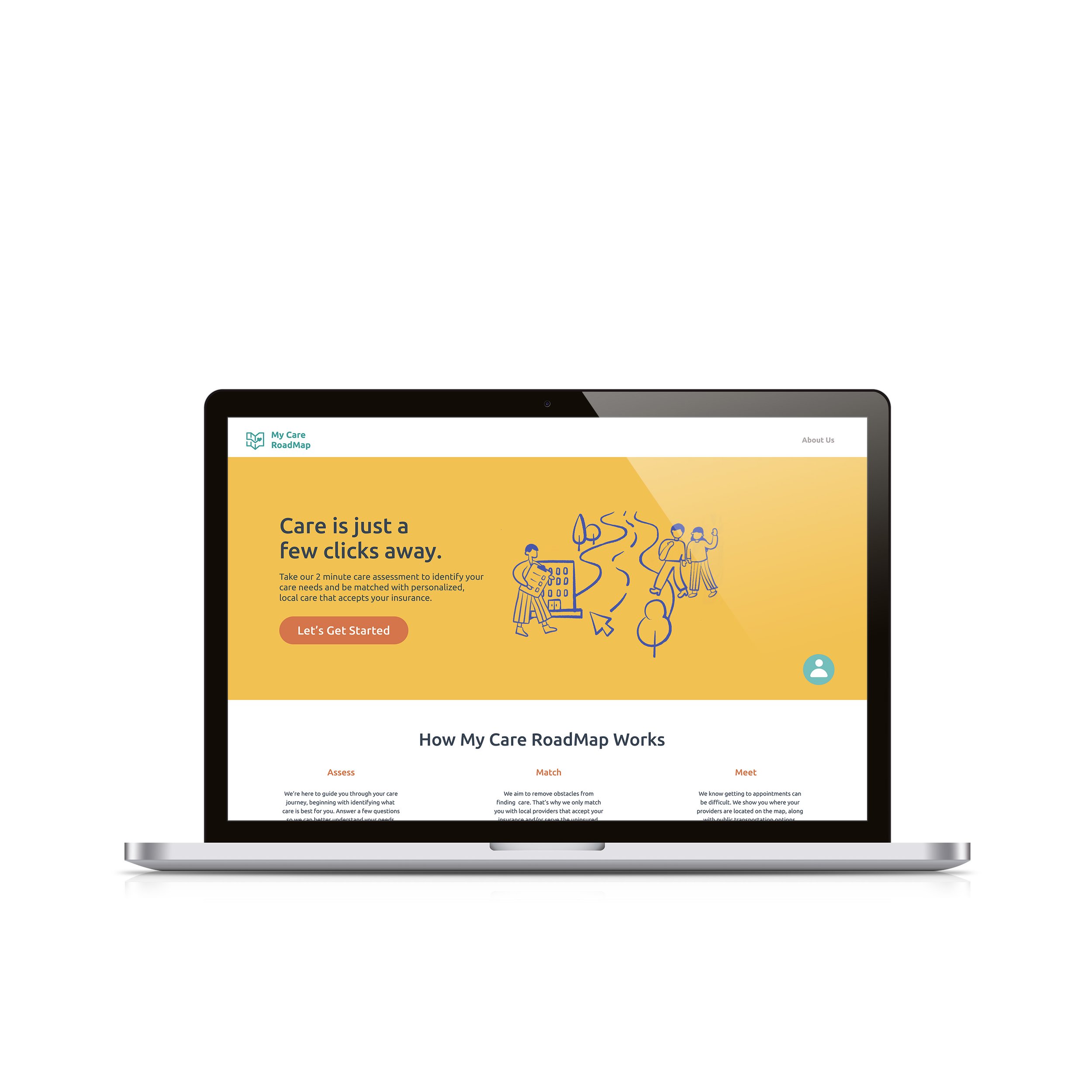
My Care RoadMap
Connecting Allegheny County constituents to personalized, local healthcare options.
ROLE
DURATION
UX/UI Design
Nov. - Dec. 2022 | 6 Weeks
CLIENT
TEAM
TOOLS
Allegheny County DHS
Maggie Hung
Figma
Figjam
Procreate
01 | OVERVIEW
CLIENT
Allegheny County Department of Human Services (DHS), specifically Alex Jutca (Deputy Director).
BRIEF
How do we help constituents of the Allegheny County Department of Human Services (DHS) — those enrolled in Medicaid and the uninsured — better access substance use and mental health treatment services?
02 | OUTCOME
My Care RoadMap
A simple, organized digital roadmap portal that helps individuals identify their care needs and presents personalized, local care options that accept Medicaid and serve the uninsured.
03 | KEY FEATURES
Digital Assistant
We designed a digital assistant feature for our home page, to answer questions in real time.
This feature was created to bring a sense of partnership, as many constituents rely on friends and family for referrals during the care search process.
Care Assessment
We designed a series of questions to assist constituents in identifying their care needs.
Constituents sometimes lack the vocabulary to identify specific symptoms, so we phrased options in broader terms that focus on feelings.
“How to Get There”
We designed an “Explore Transit” page to enable constituents to locate care locations easily.
We also included a ride/walk duration feature to help constituents better plan their journey and thus increase their chances of getting to appointments.
04 | RESEARCH
Overview of The Problem Space
Given the broad nature of the project brief and the fact that DHS had no prior research informing the approach to this problem, we anticipated that this project would come with a unique set of challenges. Some of these included:
Understanding DHS’s Resource Offerings and Who Uses Them
To establish a contextual background, we conducted secondary research, literature reviews, and bi-weekly meetings with our client.
We also interviewed community partners at three different local organizations: BRIDGE Outreach, RIvER Clinic, and Allegheny Health Network.
Understanding Constituent Pain Points
Based on our research, we found that the frequent utilizers of the service in Allegheny County:
Based on our research, we also found three main pain points faced by constituents who were not in crisis.
How Might We…
05 | DESIGN
Creating a simple, organized digital roadmap portal that helps constituents identify their care needs and presents personalized, local care options that accept Medicaid and serve the uninsured.
Design Iterations | Initial Design
We initially created a digital portal that utilized filters to enable constituents to select the type of service, their insurance, meeting preferences, and provider identity preferences.
Based on their selections, the constituent would be matched with local providers who fit their insurance and preference requirements.
Problem and Suggestions
After discussing our initial design with our client, we identified a significant issue: the filter options rely on users having a knowledge of clinical terms (e.g., identifying their condition as Depression), which they may not possess. This reliance on specific vocabulary could hinder users from effectively navigating the system.
For this reason, we changed our filter terminology to be less symptom-focused and instead focused on broader feelings. We also took our client’s suggestion to replace the filters with a questionnaire to understand constituent needs better.
Design Iterations | Final Outcome
Homepage Design
A clear, welcoming homepage invites constituents to take a brief care assessment with just a few clicks, offering a centralized, single-source of truth for all of their care needs.
Care Assessment Design
A 5-question care assessment offers constituents a quick, easy way to access vital information about respective care options.
Care Matches Page Design
After completing the care assessment, constituents are directed to their care matches page, which features both treatment centers and providers that fit their criteria and preferences.
Marketing Materials
We also created marketing materials with QR codes to distribute to local partners, such as public libraries, community centers, and brick-and-mortar treatment locations. We envision these as advertisements at bus stops and on buses themselves.
06 | VISUAL DESIGN SYSTEM
Moodboard and Color Palette
We wanted to evoke a sense of Pittsburgh community in our design, which informed our color palette choices. We used yellow as our primary color, which also matches the DHS website homepage. We also created several accent colors to make our design more cheerful and dynamic. Two color palettes were created, one dark, one light, to allow for readability and appropriate contrast balance on the website.
Logo
Illustrations
We wanted our logo to speak for itself and to be easily recognizable. The map refers to the concept of the digital roadmap, and the heart represents care.
We created it in Adobe Illustrator. The font used is Ubuntu in Bold. The color is Teal, Hex #419F9B. We also created another version of the logo to use on dark backgrounds, such as the bottom of our homepage and marketing flyers.
The illustrations were drawn by my design partner, Maggie Hung, in Procreate. The stroke style was created with the Mercury brush, which lends itself to a more organic and bespoke image. The people were drawn with neutrality in mind, in hopes of conveying inclusivity.
Typography
Our type system consists of two variations of Ubuntu (regular and medium).
Ubuntu is sans-serif, uses OpenType features, and is manually hinted for clarity on desktop and mobile computing screens.
07 | FUTURE PLANS


